How Might We Design a Better UX for B2B and Enterprise Products?
Summary
IINxpress (Codename) is a utility software that provides customized solutions for the world’s largest oil and gas company. This utility is connected to the hardware communication equipment deployed by MOXA for clients in refineries, drilling platforms, oil pipeline systems, and more. It helps customers monitor remotely, analyze real-time data, and eliminate obstacles. In the past, recording data and on-site troubleshooting required a lot of human resources and money, but digital transformation has made it possible.
I was invited to join the IINxpress Software UX Optimization Project with an engineering team of over 25 people. I managed stakeholders’ requirements and incorporated them into the user research. I also mentored a junior product designer, and we created a comprehensive report with 56 pages and a 3-hour pitch.
My Role
- Lead Product Designer
- User Researcher
Deliverables
- Research Proposal
- User Interview
- UX Research Report
- Pitch & Decks
Duration
2021.9 – 2021.11
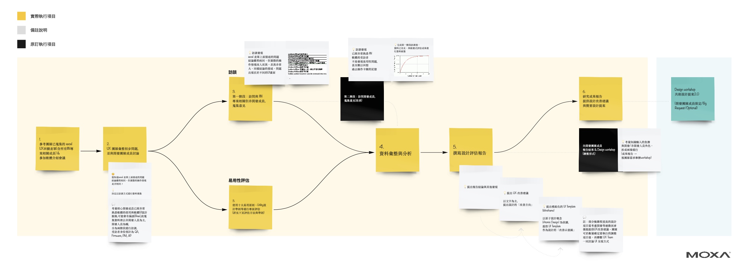
Research Scope & Process
- All UIs related to the process and behavior of the Online and Offline Settings in the IIN utility software (as the engineering team requested in the UX evaluation application form).
- Unable to assess interfaces that lack actual data input on the interface.
Research Methodologies & Evaluation Criteria
- Semi-structured Interviews
- Heuristics Evaluation
Evaluation Criteria
I. Evaluation Criteria of User Interface
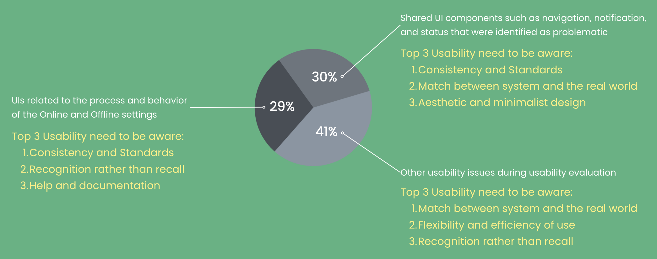
- 10 Usability Heuristics for User Interface Design
- Microsoft Win32 Design Guideline
- Microsoft UX checklist for desktop applications
- Microsoft Design System for Windows
II. Severity Ratings for Usability Problems
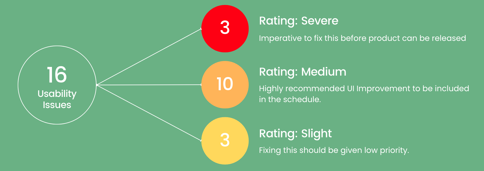
We referenced the NN/G Group’s Severity Ratings for Usability Problems to categorize usability issues into three levels, providing examples for each.
Severe
Imperative to fix this before the product can be released
Reason: The current user interfaces may lead to unforeseen and irreversible situations, resulting in negative user experiences such as confusion, frustration, and dissatisfaction.
Examples of relevant situations include:
- Users may encounter difficulty interpreting or making decisions when using the UIs, resulting in an inability to proceed with the next step in the setting process.
- The user interfaces may cause users to make mistakes (accidental clicks, deletions, misjudgments), resulting in data loss.
- The operation interface lacks error handling prompts to notify users of incorrect settings.
Medium
Highly recommended UI Improvement to be included in the schedule
Reason: While the operation won’t result in irreversible situations, users take significant time to explore and learn the interfaces. Users find it difficult to comprehend the process at first glance and often complain about its complexity. These UIs often lead to a confusing user experience that requires repeated operations, guessing, memory load, and a high learning curve.
Examples of relevant situations include:
- Issues with operational logic
- Problems with message consistency
Slight
Fixing this should be given low priority
Reason: While the operation won’t result in irreversible situations, it has not received any complaints from the user due to its relatively minor impact compared to other critical issues. However, these user interfaces must still meet the evaluation criteria for a satisfactory user experience. The improvement would be beneficial.
What We Found: An Overview of Usability
⚠️ 56 usability issues were found in the evaluation. 16 cases were related to Online and Offline settings, 17 were with shared UI components, and 23 were classified as other usability concerns.
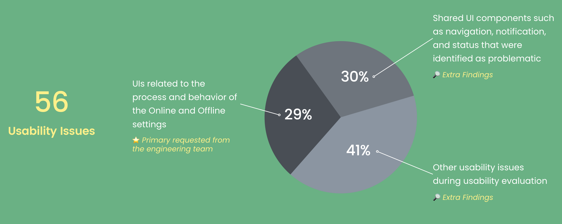
What We Found: Classification of Usability Problems
What We Found: How’s the Severity?
We identified 16 usability issues with the Online and Offline settings during a Heuristics Evaluation. The severity markings were then prioritized to guide the engineering team in fixing these issues.
Research Report
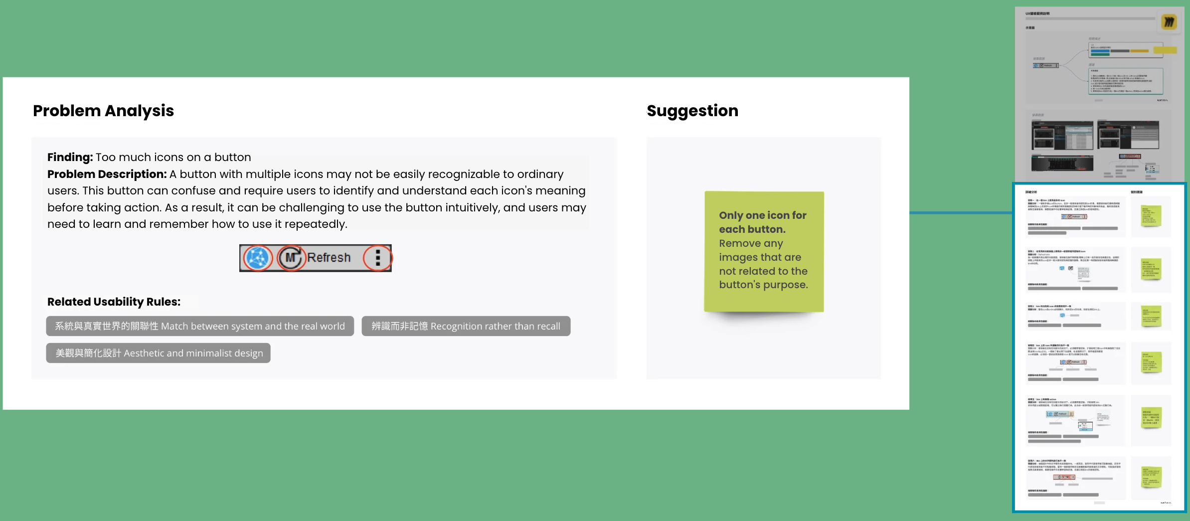
We created a comprehensive report with over 6,000 words and 56 pages, including screenshots of the software, problem statements, severity of usability issues, insights, recommendations for fixes, and examples of the modified UIs.
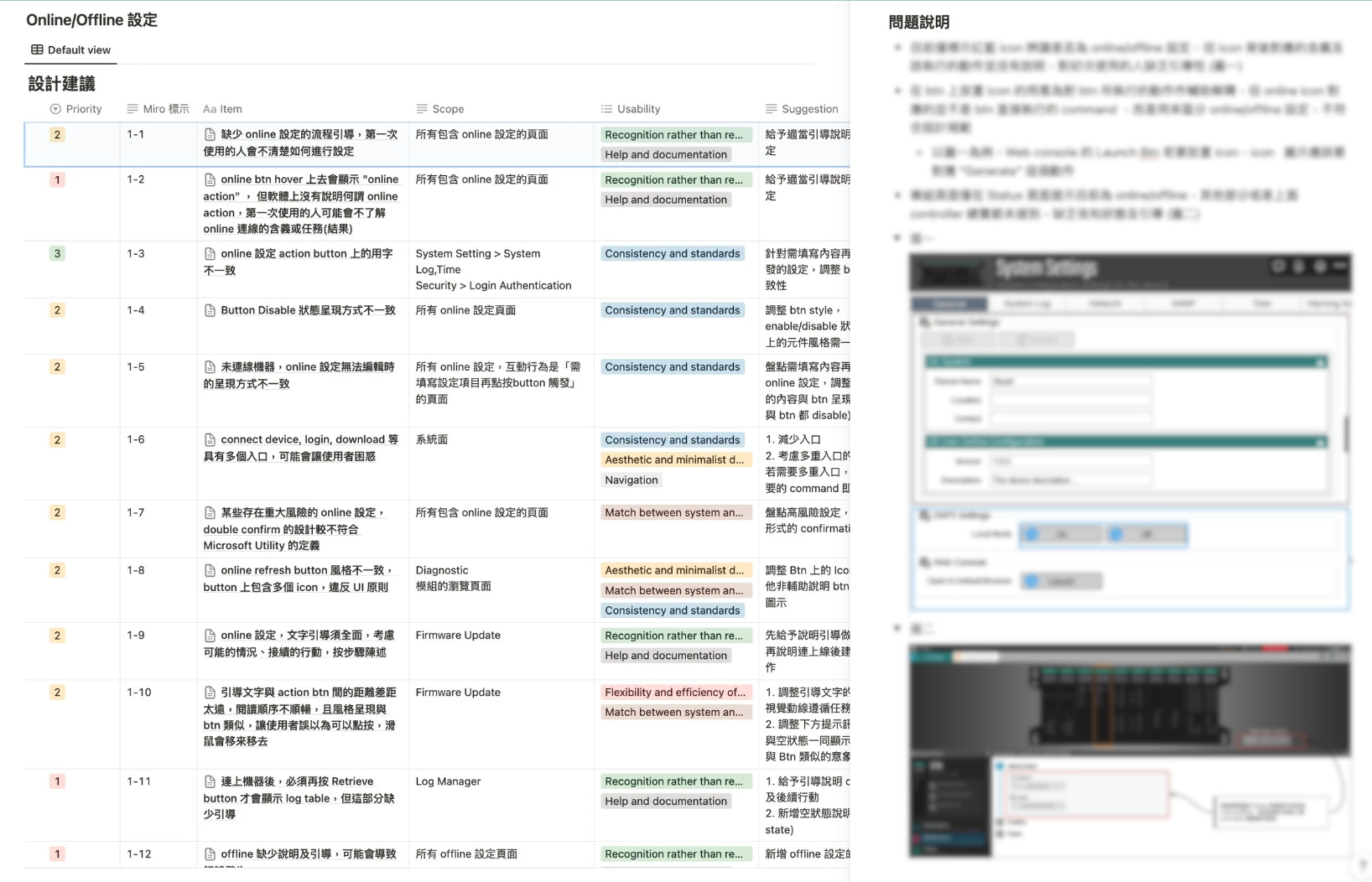
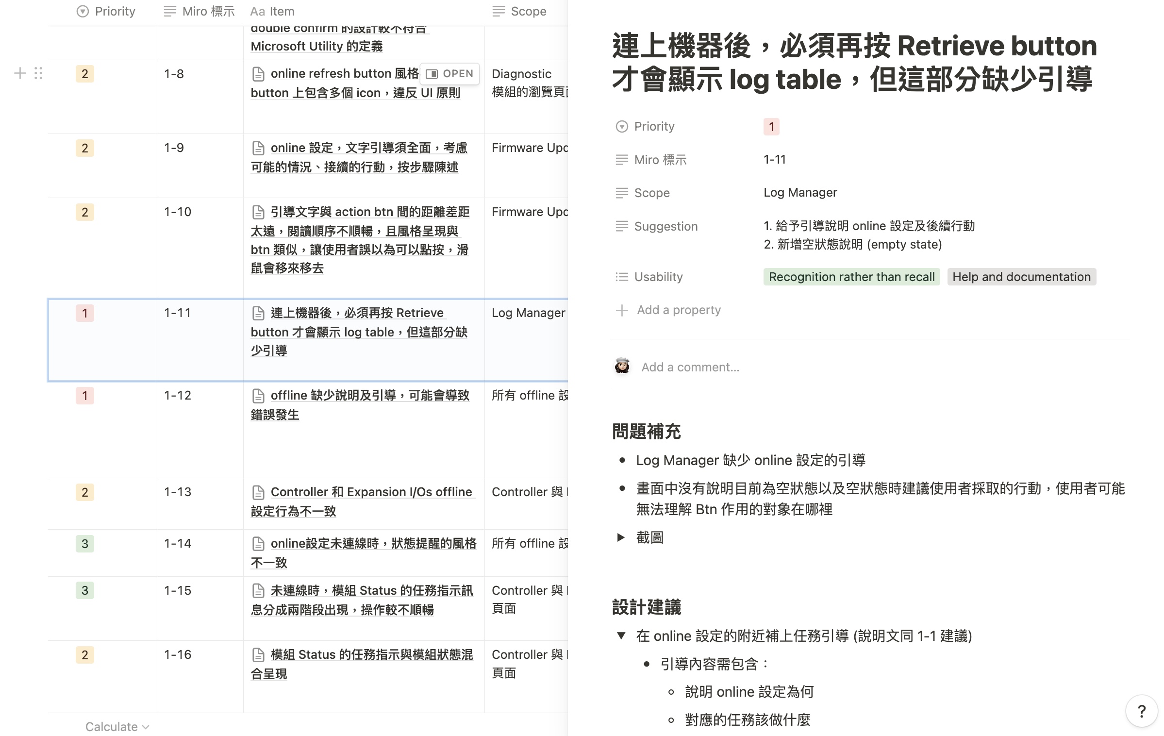
💡 It served as a guide for both education and achieving the original goal, helping the engineering team understand the importance of UX and providing a quick problem-solving guide.
Insight and Usability Guidelines
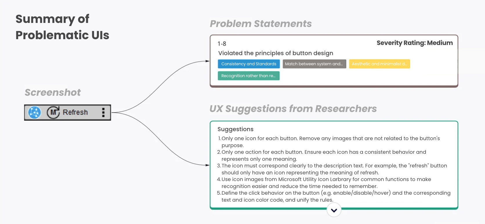
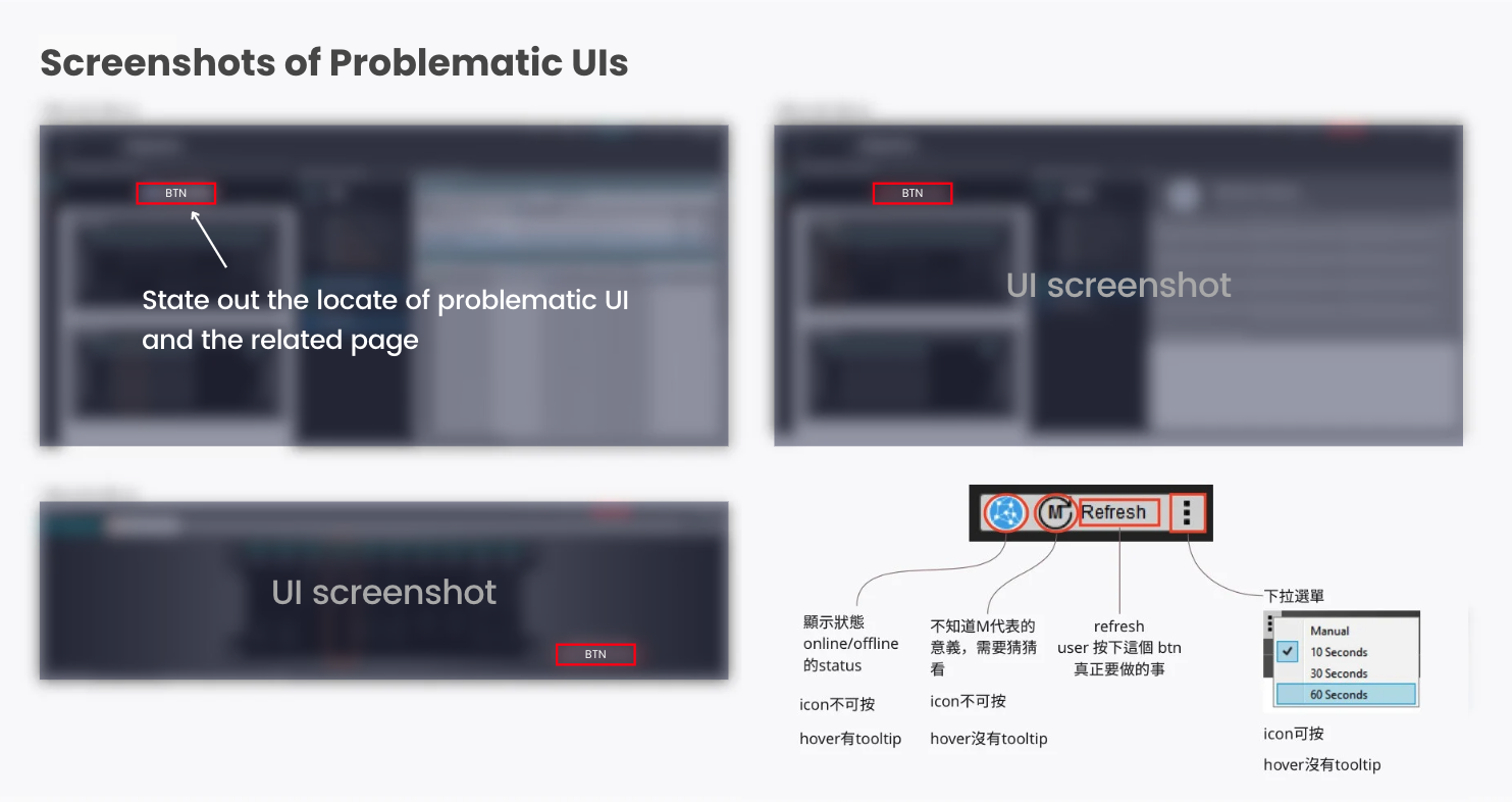
Here is an example of our pitch deck that demonstrated how UX Researchers analyzed and provided suggestions for evaluating the usability of IIN utility software.
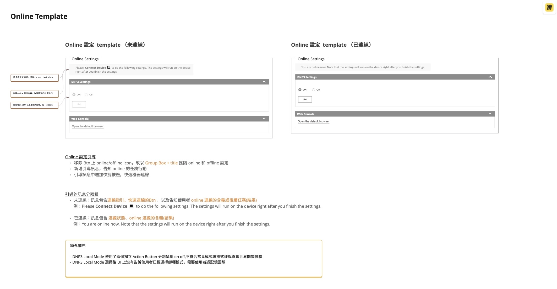
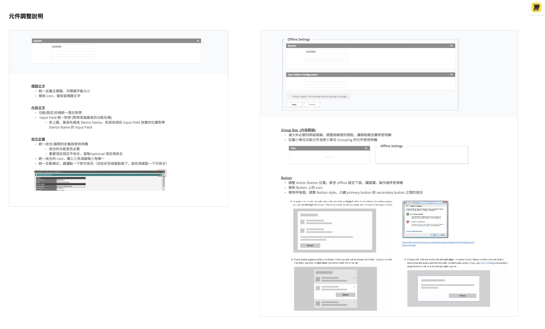
Example of the Modified UIs
We provide UX suggestions and the best examples of modified UI wireframes for various usability issues.
Takeaway
Working with the IIN engineering team was a pleasant experience. From my perspective, I believe that we executed three key actions successfully:
1. No jargon, only simple words.
2. Establish a foundation of trust before jumping into solutions.
3. Using How Might We technique.
As the pioneer of UX research at Moxa, I am proud of our teamwork.
Impact
The following changes as a result of our research recommendations:
- The UIs rating of severe were fixed prior to product release.
- Word changes were made to improve understandably.
- The problematic shared UI components were included in the schedule for changes.
- A follow-up design collaboration has been initiated.